Art Direction & Design
Carecubes
Designing a Brand to Respond and Protect During a Pandemic

Born out of necessity during the COVID-19 pandemic, Carecubes was created to provide frontline caregivers with affordable, reusable, and rapidly deployable isolation technology. Designed to meet the immediate challenges of global health crises, the Carecubes brand needed to reflect its mission of protection, compassion, and innovation.
Through logo and wordmark development, typography, color exploration, and collateral design, the visual identity of Carecubes was crafted to balance calm empathy with technical reliability. Launched during the height of the pandemic, the brand quickly became a symbol of hope and preparedness for care facilities.
Project Type
Branding, Visual Design
Role
Art Director, Lead Visual Designer
Crafting the Carecubes Mark
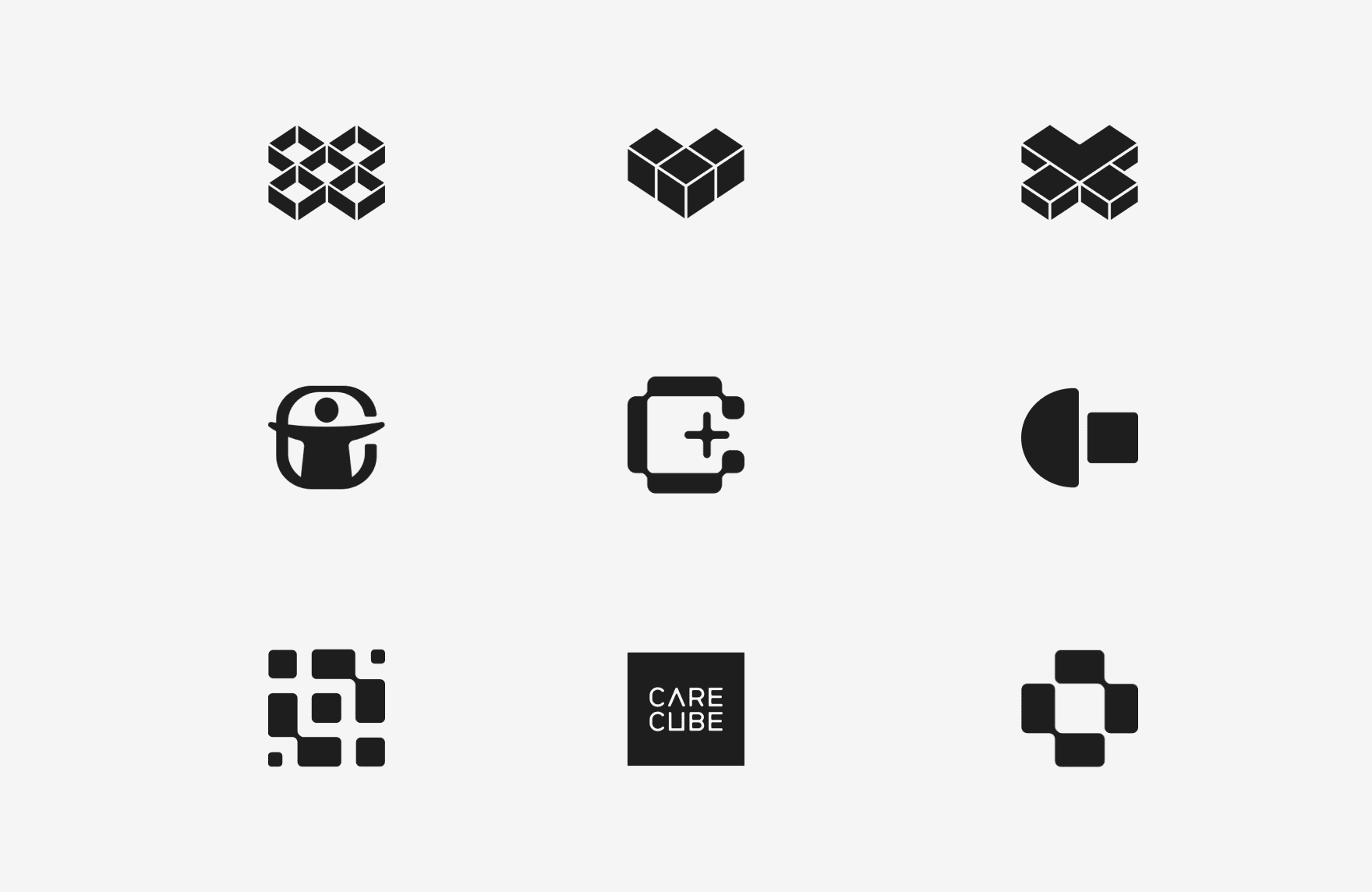
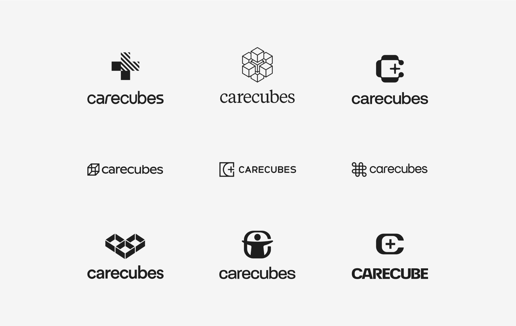
We explored a variety of logomarks and wordmarks that symbolized Carecubes’ mission of protection, compassion, and innovation. The designs also reflected the functionality of the product, incorporating elements like medical symbols, modular shapes, and clean lines to visually communicate Carecubes’ purpose and practicality.
Color and Typography with Purpose
Various color combinations and typography options were tested to create a visual language that balanced warmth and trustworthiness with technical precision. The aim was to develop a palette and typeface that resonated with diverse audiences, from healthcare professionals to corporate stakeholders, ensuring accessibility and professionalism across all brand touchpoints.

The Final Identity
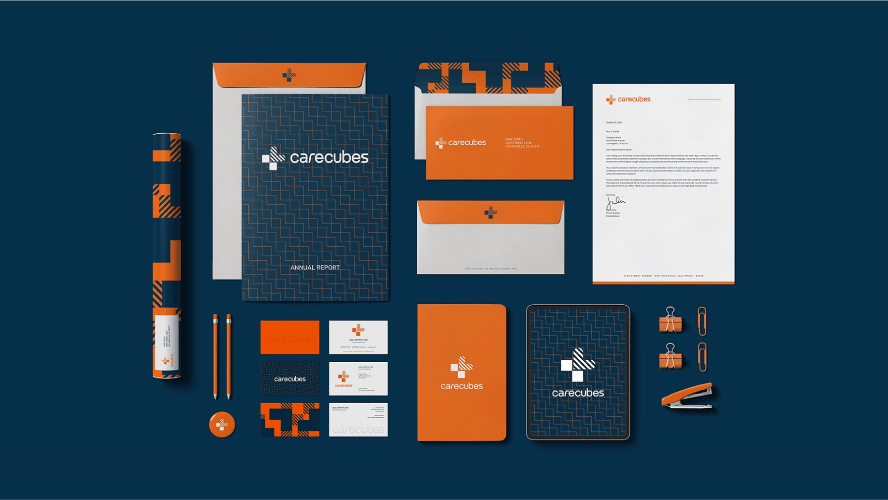
The selected design direction unified all brand elements into a cohesive identity. A clean logomark, calming color palette, and modern typography came together to represent Carecubes as both an innovative and compassionate pandemic response leader. This final identity became the backbone of the brand, supporting consistent and clear messaging.


Empowering Teams with Branded Tools
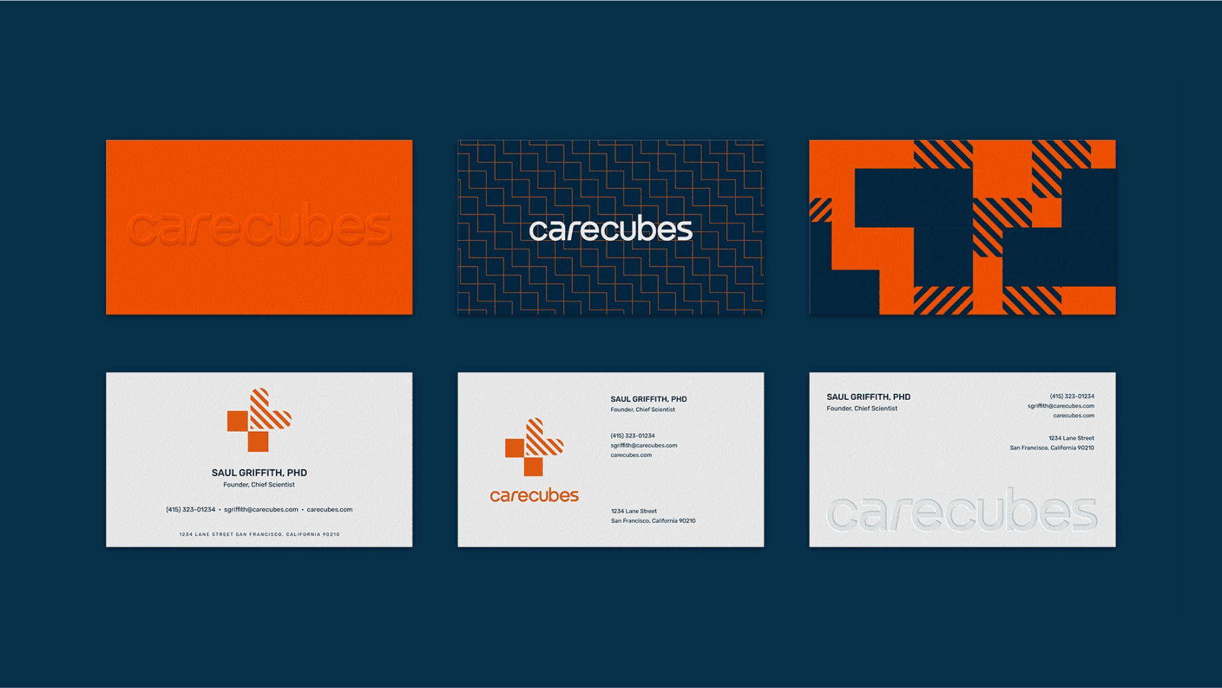
A suite of branded tools, including business cards, letterheads, and presentation templates, was developed to unify internal and external communications. These materials equipped Carecubes teams to clearly articulate their mission, values, and offerings, enhancing professionalism and fostering stronger relationships with partners and stakeholders.
Making an Impact in the Real World
Out-of-home visuals, including billboards and posters, were designed to showcase Carecubes’ mission and life-saving solutions. Bold messaging and impactful imagery helped these materials resonate with key audiences, ensuring the brand’s purpose was clearly communicated in high-visibility locations such as healthcare facilities and public spaces.


Merchandise to Spread the Message
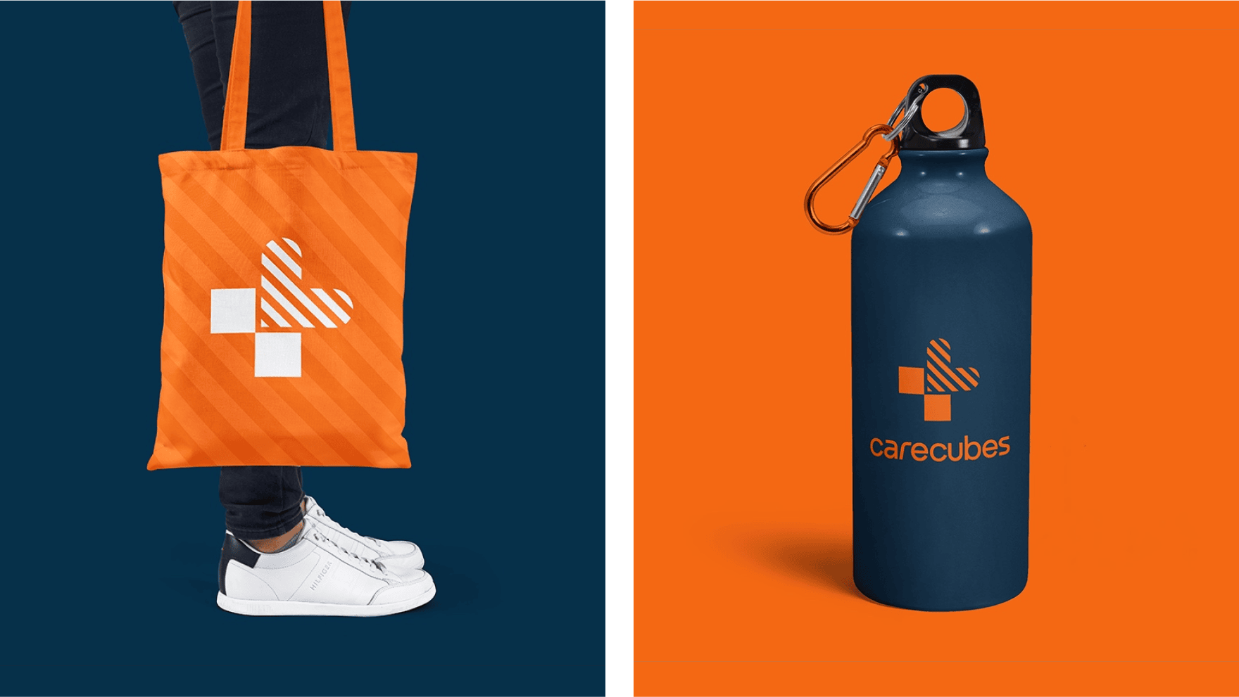
Branded merchandise extended Carecubes’ identity into the hands of employees, supporters, and customers. Items like apparel, tote bags, and practical tools were thoughtfully designed to reflect the brand’s mission while building awareness and pride among its community.


Bringing the Brand to Life Online
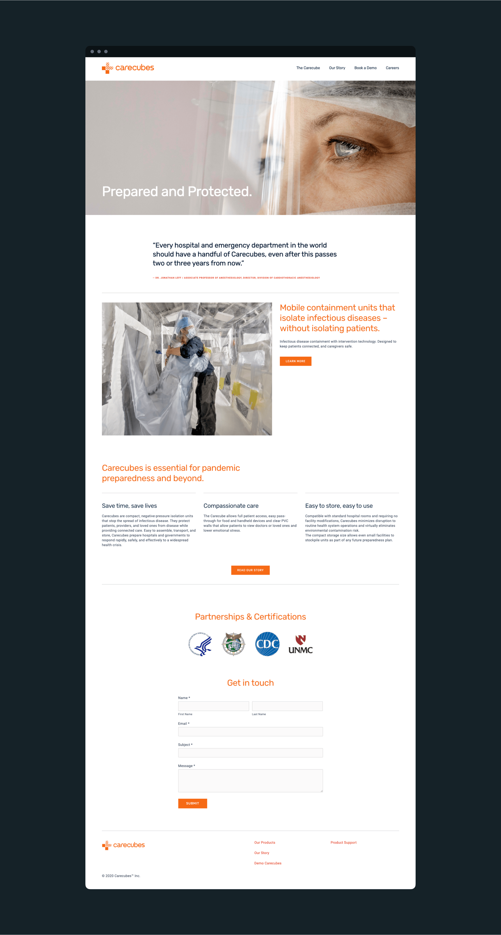
We designed and launched a sleek, user-friendly Squarespace website to serve as CareCubes’ digital hub. The site highlighted the company’s mission, products, and values through clean layouts, engaging visuals, and intuitive navigation. Tailored to meet client needs, the website provided an accessible platform to inform potential customers, drive inquiries, and establish a strong online presence.
Defining the Rules with Brand Guidelines
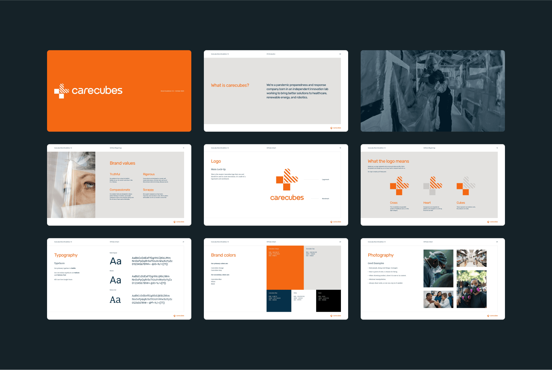
A comprehensive brand guidelines document was developed to ensure consistency across all touchpoints. It included detailed instructions for logo usage, typography, color palettes, and photography, equipping teams and partners with the tools needed to maintain a cohesive and professional brand identity.
Outcome
The Carecubes brand was successfully launched during the height of the pandemic, receiving praise for its thoughtful and impactful design. The visual identity resonated with healthcare providers and decision-makers, positioning Carecubes as a trusted leader in pandemic response and preparedness. This brand identity set the foundation for continued innovation and growth, enabling Carecubes to stand out in a critical global moment.
Team
Josh Kamler — Creative Director, Copywriter, Content Strategist
© 2025 Gilbert Cordial